In today’s fast-paced digital world, your website is often the first impression potential customers get of your business. But what happens when your site doesn’t display properly on mobile devices or takes too long to load? You lose visitors — and potential revenue.
That’s where responsive web design comes in. It’s no longer a trend; it’s a necessity for business growth.
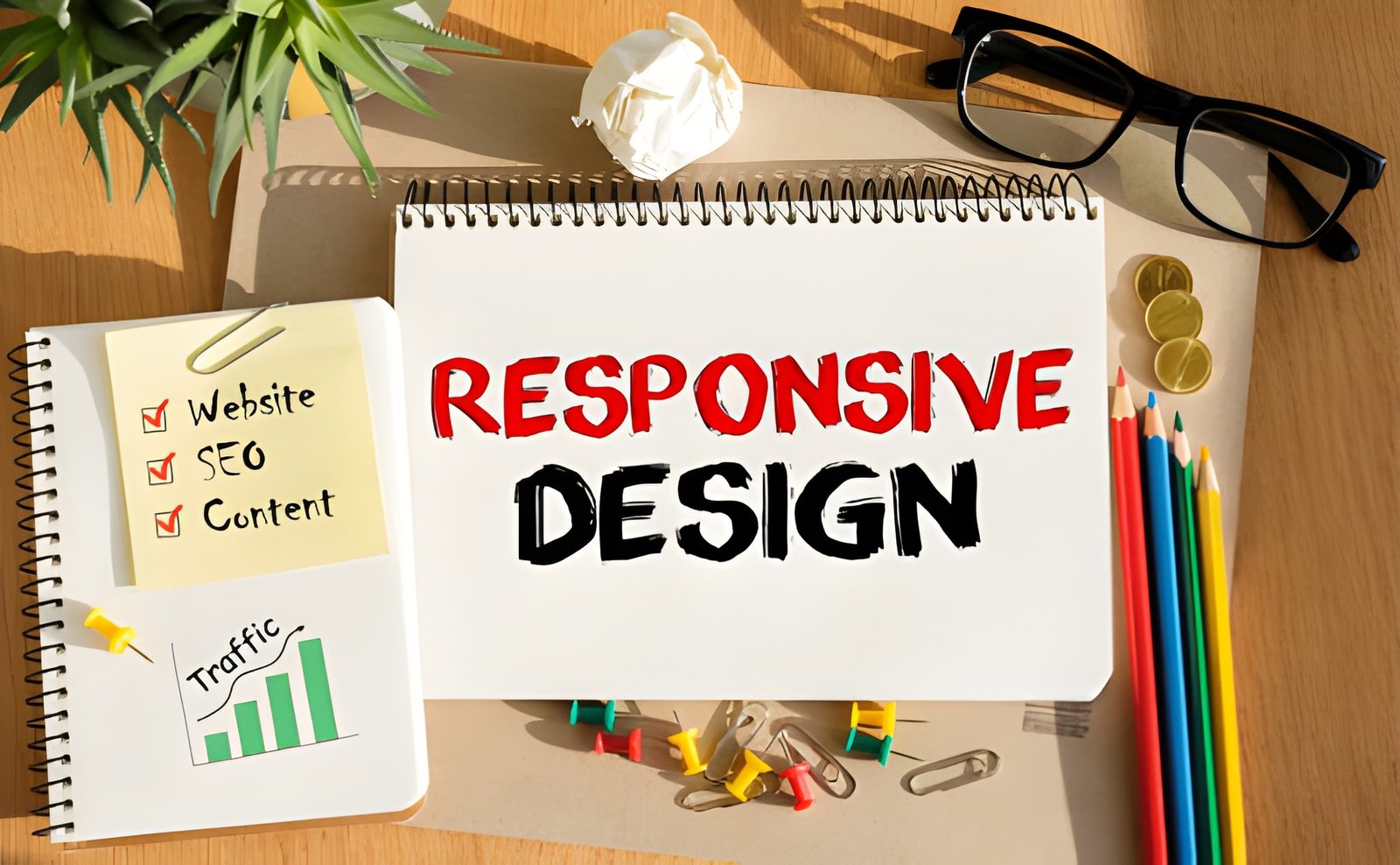
What is Responsive Web Design?
Responsive web design (RWD) is a modern design approach that ensures your website looks and functions perfectly on all devices — desktops, tablets, and smartphones.
Rather than creating separate websites for different devices, responsive design uses flexible layouts, images, and CSS media queries to automatically adapt to the user’s screen size.
In simple terms, a responsive website adjusts itself for the best viewing experience, whether someone’s browsing on a 27-inch monitor or a 5-inch smartphone.
Why Responsive Design Matters More Than Ever
According to recent studies, over 70% of website traffic now comes from mobile devices. If your site isn’t optimized for mobile, you’re likely losing a significant portion of your audience.
Google also gives ranking preference to mobile-friendly websites, making responsive design a critical SEO factor.
Here’s why responsive web design has become indispensable for modern businesses.
1. Improves User Experience (UX)
User experience is everything. When visitors land on your website, they expect smooth navigation, fast loading, and easy readability.
A non-responsive website forces users to zoom in and scroll horizontally — a frustrating experience that often leads to high bounce rates.
Benefits for Businesses:
- Visitors stay longer on your website.
- Increases chances of conversion.
- Builds trust and credibility with users.
A great UX makes your brand look professional and reliable, which directly influences customer decisions.
2. Boosts Search Engine Rankings (SEO Benefits)
Google’s algorithm is mobile-first, meaning it primarily crawls and indexes the mobile version of your website.
If your website isn’t mobile-friendly, your rankings will drop, regardless of how great your content is.
How Responsive Design Helps SEO:
- Google recommends responsive web design.
- Reduces duplicate content issues (no need for separate mobile URLs).
- Enhances site speed — an important ranking factor.
- Lowers bounce rates by improving usability.
A responsive website helps search engines understand and index your content efficiently, increasing your visibility in search results.
3. Cost-Effective and Easy to Maintain
Before responsive design, companies used to maintain two separate websites — one for desktop and another for mobile.
That meant double the effort, double the cost, and double the maintenance.
Responsive web design solves this by offering one unified solution that works across all devices.
Key Advantages:
- One website = reduced development and maintenance costs.
- Easier to update and manage content.
- Better consistency across all platforms.
In the long run, a responsive website saves you time, effort, and money, allowing you to focus on growing your business.
4. Increases Conversion Rates
A beautiful website means nothing if it doesn’t convert visitors into customers.
Responsive websites create a seamless shopping or browsing experience, no matter what device users are on. This encourages them to take action — make a purchase, fill out a form, or contact you.
How It Impacts Conversions:
- Simplified navigation = better engagement.
- Faster load times = reduced bounce rate.
- Consistent layout = increased trust and clarity.
When users find it easy to interact with your website, your conversion rates improve naturally.
5. Enhances Brand Reputation and Credibility
Your website represents your brand’s digital identity.
A poorly designed or non-responsive site sends the wrong message — that your business is outdated or unreliable.
On the other hand, a responsive and modern design reflects professionalism and attention to detail, helping your business stand out in a crowded online marketplace.
The Branding Advantage:
- Builds trust with customers.
- Creates a consistent visual identity.
- Shows that your brand values innovation and user satisfaction.
First impressions matter — and a responsive site ensures they’re always positive.
6. Adapts Easily to Future Devices
Technology is evolving fast. New devices with varying screen sizes appear every year — from smart TVs to foldable smartphones.
A responsive web design automatically adjusts to these changes, ensuring your website stays future-proof.
Instead of redesigning your site every time a new device launches, a responsive framework ensures your layout and content remain adaptive.
7. Better Analytics and Tracking
Tracking user behavior is crucial for marketing success.
With a single responsive website, you can gather unified analytics and gain clearer insights into how visitors interact with your content across devices.
What You Can Measure:
- Device performance (desktop vs. mobile).
- User journey and interaction patterns.
- Conversion rates across screen sizes.
This data helps you make smarter design and marketing decisions for continuous growth.
How to Make Your Website Responsive
If your current website isn’t responsive yet, here’s how you can fix it:
- Use a Responsive Framework: Choose mobile-friendly platforms like WordPress with responsive themes.
- Implement Fluid Grids: Use relative units (%, em, rem) instead of fixed pixels.
- Optimize Images: Compress and scale images for faster loading.
- Test Across Devices: Use tools like Google Mobile-Friendly Test or BrowserStack.
- Hire Experts: Work with professional web designers who specialize in responsive web design to ensure perfect execution.
Conclusion
In today’s mobile-driven world, responsive web design isn’t optional — it’s essential.
It enhances user experience, boosts SEO rankings, saves money, and strengthens your brand reputation — all of which lead to sustained business growth.
Whether you’re building a new site or upgrading an existing one, investing in responsive design ensures your business stays competitive, accessible, and ready for the future.